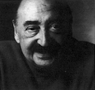
from Cinegraphic.net:
Saul Bass – Animating Modernist Design
story © internetted, August 28, 2011 all rights reserved.
URL: https://www.cinegraphic.net/article.php?story=20110826144209282
Saul Bass (1920 – 1996) was the first of the new “title designers” to emerge in the 1950s, setting the precedent for those who followed. He moved to Hollywood in 1946 after spending time in New York as a student working and learning graphic design. Once in Hollywood, he worked as a graphic designer, title designer, visual consultant, and director of both short films and one feature, reflecting the basic paradigm shifts underway in the 1950s and continuing through the 1970s as Hollywood production abandoned the industrial model of the studio system. He would ultimately produce fifty-nine title sequences between 1954 and 1996, revealing the influence of Modernist graphic design in his engagement with both static and motion elements on screen.

These transfers between screen and print are apparent in the form and style of the work he is best known for producing: highly graphic, animated feature film titles that translated the types of Modernist forms used in print by designers, such as Paul Rand and Alvin Lustig, into motion. Bass was principally responsible for the “title designer” as a major role in media production, and the field of motion graphics was partly defined by his work.
Before working in film as a title designer, he trained in graphic design as a part-time student at the Art Student’s League in New York with Howard Trafton, then at the Brooklyn College under György Kepes from 1944 to 1945. Kepes’ influence on Bass is apparent in his embrace of the highly minimal, geometric Modernism characteristic of the Bauhaus. It is through this relationship to the aesthetics of print that his work brought a new design aesthetic to the production of animated film titles. His first film project with Otto Preminger was as a graphic designer. He produced an advertizing poster for the film Carmen Jones (1954). When he was hired to adapt this design for the credits of the film itself was the beginning of his work as a title designer; Bass was hired again on Preminger’s next film to create another poster, this time for The Man With The Golden Arm (1955). He would collaborate with Preminger on a total of thirteen films. As before, he subsequently animated his poster design for the main title sequence, again receiving on-screen credit as the titles’ designer. The animation itself was executed by the UPA company, and it was through that connection that Bass would meet the abstract film maker John Whitney. While The Man With The Golden Arm made Bass into the first of the title designers to become a “star,” even before the success of this title sequence he was working on other title sequences that collectively established his reputation: Robert Aldrich’s The Big Knife (1955) and Attack! (1956), Jose Ferrer’s The Shrike (1955) and Billy Wilder’s The Seven Year Itch (1955). Bass would produce the majority of his film titles during the 1950s and early 1960s. It is this period when he established himself as the premiere title designer, and had designed sixteen title sequences, often with associated print campaigns, between 1954 and the end of 1957, and a total of thirty-eight by 1970, more than half his career total.
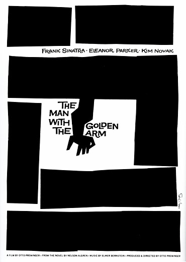
In the accompanying print campaign for The Man With The Golden Arm, (1955) the images of the stars were either eliminated or minimized, allowing Bass’ iconic form to dominate; as with Preminger’s titles for Fallen Angel, the design and visual content of the titles reflects elements of the dramatic narrative, as Bass explained about his design concept:
The Man With the Golden Arm was a film about drug addiction, and the jigged form of the arm expressed the jarring disjointing that exist in a drug addict which expressed the climax of the film.
[Transcript from the film Bass on Titles, directed by Saul Bass, 1977]
The film was an adaptation of Nelson Algren’s novel that focused on the taboo of drug addiction. It is a design that obliquely referenced its content—abstracting the references to heroin into a more conceptual engagement with the subject while still confronting its content through the contorted shape of the arm itself; this story of a Jazz musician struggling with his drug addiction is reflected by the implied violence of the graphics. Unlike Preminger’s earlier design for Fallen Angel (1948) where road signs combined with a long take watching the bus navigate the road is obvious, perhaps even cliché, the titles design by Bass are more conceptual in their sourcing and Modernist in design. The limited formal vocabulary of lines, sans serif type and graphic composition mark these titles as belonging to the International Style that emerged as the dominant post-war graphic design school.
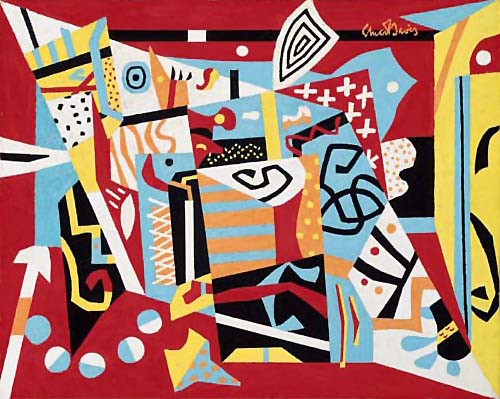
At the same time, these titles draw on a specifically American Modernist source: the painting of Stuart Davis, whose combinations of flat graphic planes and sharply cut angles evoke Jazz both indirectly through their visual form, and directly via their titles, (combined with the American version of International Style common to graphic design in the 1940s and 1950s). Thus while the design is specifically Modernist, its references make the meaning apparent to knowledgeable audience members: the connection of painting concerned with Jazz to a film narrative concerned with a Jazz musician is no less obvious than in Fallen Angel, but results in a title sequence where the conceptual linkage requires a recognition of Davis’ painting in the design executed by Bass.
 (via Art of the Title)
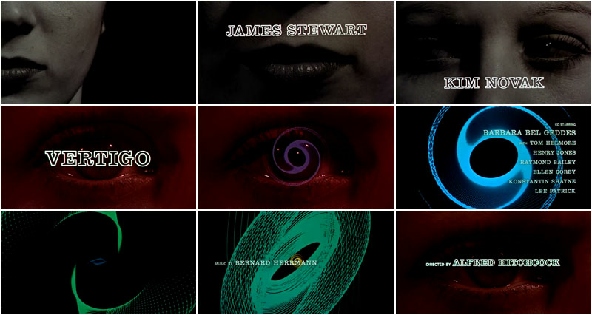
The title sequence for Alfred Hitchcock’s film Vertigo (1958), brought Bass into collaboration with John Whitney who produced the spirals that dominate this opening. It reflected the convergence of avant-garde film and commercial media production that had been developing throughout the 1950s, most especially around television. The relationship established between Bass and the Whitneys continued throughout his career—the 1984 animated logo for AT&T (the new company formed after the anti-trust suit’s end) was done by John Whitney, Jr. This collaboration reflects Bass’ comment about the American avant-garde to historian Pat Kirkham in 1995 that:
They created a great yearning in me to emulate this, to do something that would embrace this kind of daring.
[Pat Kirkham, “Reassessing the Saul Bass and Alfred Hitchcock Collaboration,” in West 86th vol. 18. no. 1 (Spring-Summer 2011) p. 54]
His focus on the American avant-garde films of Maya Deren and Kenneth Anger, both central figures in the New American Cinema of the 1950s and 1960s. The influence of avant-garde film on the development of film titles and television design (especially advertizing design) was part of the shift towards the Modernist aesthetic that came to dominate design during the 1950s. As in Bass’ earlier sequences, the visual design of the titles in Vertigo proceed through an ambiguous visualization of the film’s central themes—in the case of Hitchcock’s film, both dizziness (one meaning of “vertigo”) and the internal psychological state itself (another meaning). Unlike the narrative, however, which follows Scottie, played by James Stewart, Bass’ sequence focused on Kim Novak, his co-star, who played Julie. He explains this focus on Novak by choosing to focus on her character, rather than Stewart’s detective:
Here is a woman made into what a man wants her to be. She is put together piece by piece. I tried to suggest something of this, and also the fragmented mind of Julie, by my shifting images.
[Pat Kirkham, “Reassessing the Saul Bass and Alfred Hitchcock Collaboration,” in West 86th vol. 18. no. 1 (Spring-Summer 2011) p. 66]
Bass’ description of the film is simultaneously accurate and misleading; it is Scottie whose mind fragments in the film, (and he who experiences vertigo), yet from the title sequence and his commentary on it, the film might tell a different story. Yet the focus of these titles on themes of sight and the spiraling dizziness that is vertigo proves effective. Each potential meaning of film’s title appears in the organization of this sequence: the a design that recalls William Golden’s animations of the CBS logo, the slowly rotating spirals rise out of a close-up of Kim Novak’s eye, their graphic form reiterating this movement throughout the entire sequence: ovals lying at the center of Whitney’s spirals become eye-shapes, each succeeding spiral playing the role of “pupil” to the earlier one’s “eye.”
North by Northwest (1959) was the second title sequence Bass designed for Alfred Hitchcock. It has an uncharacteristic studio graphic at the head of the film: instead of the customary black background for the MGM logo, it is the same green used throughout the rest of the titles. This integration of the studio’s logo design into the title sequence is highly unusual, (only at the end of the twentieth century would the meshing start to become common as the WB logo became an integral part to the opening of title sequences). During the 1960s, This type of integration was highly unusual—MGM would do something similar with André François’ titles for The Fearless Vampire Killers (1966), but this integration did not appear in the majority of its other productions.
In addition to the studio logo, the design used in North by Northwest integrates the opening abstract animation into the opening shot of a mirrored skyscraper in New York, a graphic match recalling the titles of My Man Godfrey (1936). This movement between abstraction and realism develops the linkages made in Vertigo further—what was only a conceptual connection in 1957 becomes a literal transformation in 1959. The combination of realist and abstract elements in this title sequence anticipated the emergence of full character animation for film titles in the next decade.
Psycho (1960) was the last title sequence Bass produced for a Hitchcock film. However, the main credit Bass received on the film was as ‘pictorial consultant,’ an ambiguous credit that requires some explanation. Bass’ explained this role as to “strangify” the Bates house, and work on the now famous shower murder sequence where Marion Crane, played by Janet Leigh, dies. For “strangifying” the house, Bass’ solution relied on optical printing:
Finally I hit on it. I matted a time-lapse moonlit, cloudy night sky—but no scudding clouds—just moving somewhat faster than normal. In the two to three-second cuts to the house (which was not long enough to reveal the abnormal rate of movement), it resulted in an undefined sense of weirdness.
[Pat Kirkham, “Reassessing the Saul Bass and Alfred Hitchcock Collaboration,” in West 86th vol. 18. no. 1 (Spring-Summer 2011) p. 73]
This solution directly shows the close technological relationship between special effects and motion graphics—both use basically the same technologies; in effect, the “solution” Bass devised was a motion graphics solution to a narrative concern. The combination of masking and compositing in optical printing are common features of Bass’ title design work, highly visible in the titles done for his previous designs for Hitchcock. It is a solution that reversed the elements of Belgian Surrealist Rene Magritte’s painting L'Empire des lumičres (Empire of Light, 1953–54) where a nighttime landscape filled with shadows is combined with a bright blue daytime sky with white fluffy clouds. The peculiar alienation of Magritte’s painting remains in Bass’ shots for Psycho: the reversal of night and day elements produced a similar sense of unease, but without an immediate understanding of why.
For the shower sequence, Bass was given the task of designing the storyboards, which Hitchcock then followed precisely in shooting. Hitchcock had collaborated with artists in earlier films—Spellbound (1946) had a dream sequence designed by Surrealist painter Salvador Dali, and the dream sequence in Vertigo was created by Abstract Expressionist John Ferren. The shower sequence presented particular challenges: less than half way through the film, it showed the death of the film’s apparent heroine; unlike most detective stories, Psycho has a surplus of investigators and only one suspect. The handling of this sequence was crucial to the success of the film. Its elaborate montage could only have been produced by careful preplanning, which Hitchcock hired Bass to produce.
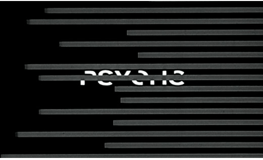
The titles design itself is a dramatization of the psychoanalytic term ‘schizophrenic’ that literally means a ‘splitting of the mind’—shown on screen by the splitting and disjuncture of the typography itself. The motions are irregular, and the moving bars that cross the screen are of different lengths and move at different speeds. The typography becomes legible only when the different parts of the type briefly align, even then sliding back and forth in sync to Bernard Herman’s staccato score. It is a title sequence where the fragmentation and momentary unities of schizophrenia are dramatized through the misalignment and break-up of the design into elements whose formal basis recalls the opening to The Man With The Golden Arm.

It’s A Mad, Mad, Mad, Mad World (1964) is a dramatic shift from the highly graphic titles Bass is best known for doing, to a more conventional animated cartoon sequence of exceptional length for a feature film title. These titles were done for an almost encyclopedic compendium of Hollywood film comedy that included actors from the silent era as well as contemporary figures from both film and TV. These titles, done in the style of the UPA studio, reflect the Modernist, limited cel animation style. They were part of a trend towards larger, more expensive and complex films in the early 1960s. The adoption of cartoon titles, however followed earlier work done for The Pink Panther (1963) by animators Friz Freleng (1906 – 1995) and David H. DePatie (1935 – ). Their title design incorporated Modernist graphic elements, but followed the more traditional and familiar character animation style developed at Warner Brothers in the 1940s by Tex Avery. The cat character designed by Hawley Pratt for the opening would reappear in later sequels such as The Return of The Pink Panther (1975), The Pink Panther Strikes Again (1976) and Revenge of The Pink Panther (1978). While highly memorable, the complex character animation of these title sequences was also both rare and unusual in Hollywood film. The titles for It’s A Mad, Mad, Mad, Mad World show the influence of other title designers whose work was also receiving critical and popular attention in the 1960s.
Bass would produce other title designs as well as logos, advertizing campaigns, and continue working until his death in the 1990s; however, his later work did not achieve the iconic status of his earlier design work. The importance and role of the title designer in the creation of a feature film that he established in the 1950s enabled other artists to make titles, in the process opening up the field for experimentation and elaboration. During the 1960s these other artists became more prominent, bringing other approaches and aesthetics to the design problems posed by the title sequence.